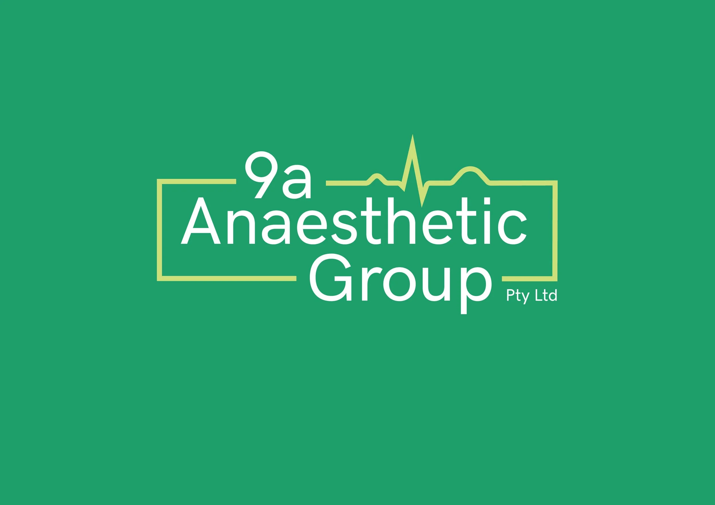
9a Anaesthetic Group works with patients who are often dealing with anxiety about their procedures so any new logo needed to reflect calmness and instil confidence, while also being a more contemporary but corporate update.
Logo Design
“Green, which is nature’s colour, is restful, soothing, cheerful, and health-giving”
- Paul Brunton
In researching colour psychology, blue is used extensively (specifically light blues) to represent calmness, friendliness and responsibility. This was reflected in many competitors using the colour in their logos. However, hues of green also emote the same calming attributes as well as stability and balance. So using a green rather than blue would help 9a Anaesthetic Group new logo to stand out in the crowd.
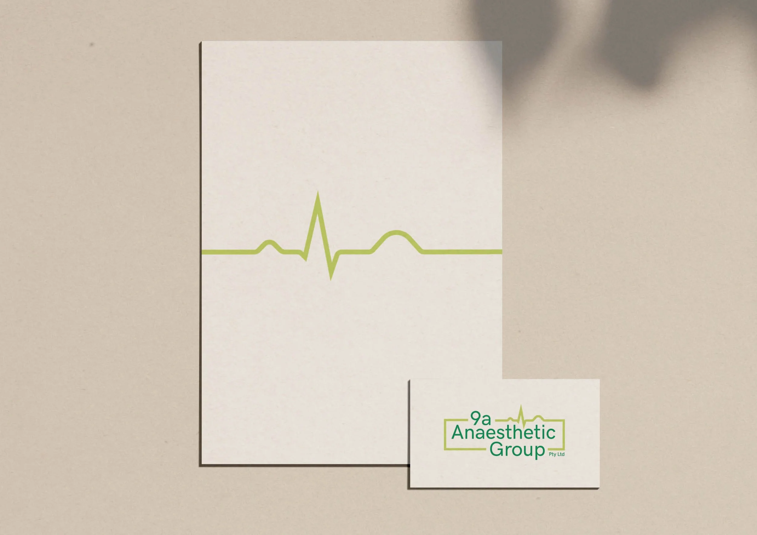
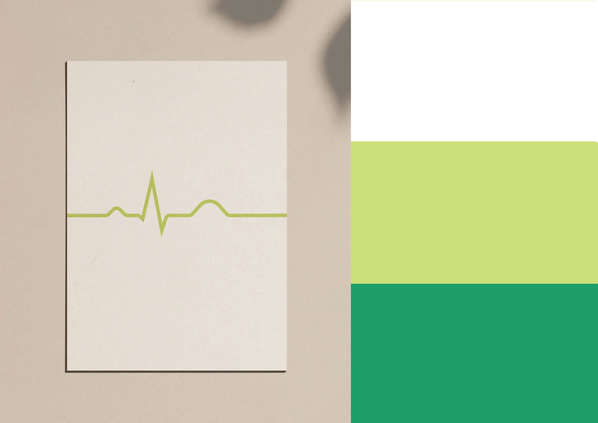
This version was a speculative colour option, however, was not the final chosen colour design for the rebrand.